Arthur and Ackhman

(Brand Identity) (Branding Services) (Prints)
Arthur and Ackhman Brand Identity Design

The Boundary

(Brand Identity) (Branding Services) (Illustration) (Packaging) (Prints)
The Boundary Brand Identity & Packaging Design
__
The Boundary is a distinguished men's sartorial brand that redefines men's fashion with a relentless commitment to quality and craftsmanship, offering modern gentlemen an empowering collection to make their mark through impeccable style. The Boundary's logo, a fusion of classic and modern design elements, embodies the brand's philosophy with the letter 'B' symbolizing setting boundaries and pushing limits in a classic yet innovative way.
We believe that the unboxing experience should be as memorable as wearing our pieces. The Boundary's packaging is a visual and tactile delight. The boxes are made from fine-quality paper, emphasizing our commitment to attention to detail. The exterior features the logo, hot-stamped in an understated and elegant manner.

Creativity Unfold 2023

(Brand Identity) (Branding Services) (Illustration) (Prints)
Creativity Unfold 2023
_Key Visual design

Discover an inspiring journey at 'CREATIVE BUSINESS CONNEXT.' This event is devoted to the revelation of future visions, igniting your creative flame, and exploring significant business prospects. Delve into our three distinguished programs: Creativities Unfold, Creative Business Space, and Creative Excellence Awards. This year, we have come up with three different key visual designs for the event.

Proudly Plant

(Brand Identity) (Branding Services) (Packaging) (Prints)
Proudly Plant
Logo, Brand Identity & Packaging Design

Kraf Vibe Bangna

(Brand Identity) (Illustration) (Prints)
Kraf Vibe Bangna
Logo, Brand Identity & key Visual design
Client : Altitude Development, Thailand

Easterly

(Brand Identity) (Packaging) (Prints)
The Easterly Project is an inspired and river life-focused that seeks to embrace the natural beauty and serenity of a river community. This concept revolves around the idea of water waves and the ever-changing colors reflected in the river throughout the day. It aims to create a harmonious and visually captivating environment that connects residents with the tranquility of waterfront living while celebrating the ephemeral qualities of nature.

Sirimongkol

(Brand Identity) (Packaging) (Prints)
Client : Sirimongkol Design Bangkok, Thailand

Sergica Gold

(Brand Identity) (Packaging) (Prints)
Client : Meko Clinic_Bangkok, Thailand
Sergica Gold, a renowned supplement & cosmetic brand, has embarked on a packaging design project to elevate its product presentation and create an aura of opulence. The central theme for this project is to incorporate the essence of gold using a hot stamp technique, enhancing the luxury experience of their products. The deep, rich gold hue will be subtly embossed into the texture, giving the box an elegant yet understated appearance.

UNESCO : Bangkok City Of Design

(Brand Identity) (Prints)
Identity design for UNESCO : Bangkok City Of Design

GQ apparel

(Brand Identity) (Prints)
PROJECT_ GQ apparel
Rebranding, Identity Design & Art Direction,
Fashion Photographer : SOUP studio
Client : Supara Group _Bangkok, Thailand

IDA.

(Brand Identity) (Prints)
Rebranding Project for ida. [Bahrain] a creative design studio providing architectural, interior design, project management and furniture procurement services for clients across the globe.

Gasaba

(Brand Identity) (Packaging) (Prints)
Gasabā’s range of all-natural, plant-sourced adaptogens are ethically sourced 
and hand-harvested in the high mountains of Bhutan.⁠

A Glimse into Modern Symbolism in 20th

(Editorial) (Illustration) (Prints)
A new interpretation on Thailand’s symbolism through images of the propagandas
from the time of the people’s revolution in the 20th century.

Edition of 50, First Published

Designer:
Poomruethai Suebsantiwongse
Kanwee Harichanwong
Sukrita Jirakornkraisang
Natnapat Kullananant

Vibre

(Brand Identity) (Packaging) (Prints)
Client : Vibre Insoles, USA.

BIKK

(Brand Identity) (Illustration) (Packaging) (Prints)
Client : BIKK Official_Bangkok, Thailand
Photography: www.bikk.co.th

3 SAN

(Brand Identity) (Illustration) (Packaging) (Prints)
An extraordinary story of the three chefs that coincided reflects one of the brightest concepts behind the restaurant “SAN”. Therefore, we brought this image that truly represents Thai Chinese fusion notion – echoing their fundamental motives.

Azure Identity

(Brand Identity) (Illustration) (Prints)
Client : AZURE Hostel_Bangkok, Thailand

Liang & Rudolf

(Packaging) (Prints)
Packaging Design

Client : Roti Group — Bangkok, Thailand

Identity Design by Andon Design Daily
Illustration by Carolina Búzio

www.liang-rudolf.com

Stella Artois WDM Invitation Card

(Branding Services) (Prints)
Stella Artois World Draught Masters 2017, Invitation Card Design
Client : Brewberry Thailand

76A

(Brand Identity) (Packaging) (Prints)
Coffee shop Located in Nakhon Phanom

Vitreous Detachment is an exceptional disorder, where apparent objects can be disdained. We took this idea to explore and apply to this outstanding coffee shop “76A”, illustrating specious arrays that are being spurned.

Photography: Pichan Sujaritsatit

Sand & Salt

(Brand Identity) (Packaging) (Prints)
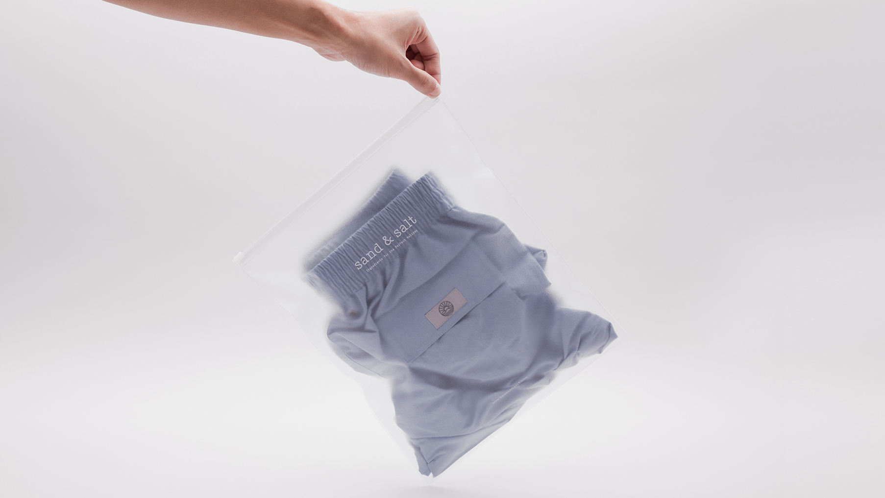
Sand & Salt sells unique characteristic design of men wears. The brand focuses on men swimwears along with matched clothes and other lifestyle accessories. Wide & Narrow service involves brand creation from naming of the brand, logo creation, product packaging design, and website establishment. The color palette, which we have decided to use for the project, composes of 6 colors. The origin of 6 colors stems from the range of hues and tones, which represents the time from sunset to sunrise and its reflection to the sea. With this concept infused with simplicity focus, we maintain the circle design to produce “brand symbol”, which represent sun, sky, island, sand, and sea to establish Sand & Salt branding.

Kaserox

(Brand Identity) (Packaging) (Prints)
Kaserox is a Bangkok-based jewellery brand. We created an identity system where the brand reflects the personality of the designer. The meaning that lies behind the branding Kaserox is a combination of three elements. The first letter of his name “Kantadaij”, his month of birth symbolised by the flower of September “Aster”, and the “OX” representing his Chinese birth year. These three elements can be moved to form different shapes around the logotype. The first photography set represents the purity of structural design, shapes and materials.

Kaserox jewellery embodies Kantadaij’s design philosophy expressed through minimalist forms with a bold yet subtle edge. His interpretation of beauty and value is clearly defined by the shape, function and quality of materials used.
Client : Canis & Bovem, Bangok Thailand

Chavana

(Brand Identity) (Packaging) (Prints)
Client : Havana by Mean Teck 1914 _Bangkok, Thailand

Dear

(Brand Identity) (Packaging) (Prints)
“Dear” — a children’s wear multi-brand store. The brand’s new identity originated from the idea of early childhood school materials. The term “Dear” itself is an intimate expression often used at the beginning of a letter. We brought these ideas together and enhanced the concept through packaging design. The pencil which comes with the shopping bag encourages children to draw freely on the bag. The materials and colors were carefully selected to convey soft tone and warm brand image. These design concepts were carried over to the interior design of “Dear” shop, which was also a part of Wide & Narrow’s service for Dear.

Vesatri

(Brand Identity) (Prints)
Vesatri A bag brand that embodies the pioneering spirit of truly international gentlemen.

C.A.P.

(Brand Identity) (Illustration) (Packaging) (Prints) (Signage)
Café and People (C.A.P.) is a store, which its long-story was originated in the historic community of Chanthaburi province, Thailand. Its logo was designed based on the various popular and distinguished characteristics and products of Chanthaburi such as rabbit, waterfall, sapphire, mat etc. These key elements are represented into one Chanthaburi’s symbol and as portrayal of the community. This project was initiated under the intention to modernize the logo, and establish new branding image as an inspiration to ultimately transform community’s perception of the existing logo.
Stella Artois World Draught Masters 2013
Invitation card design for regular and VIP guest.
Client : Brewberry Thailand
Please rotate your device!